| |
| 12.1 |
Data Collection, Organisation and Representation Process, and Interpretation of Data Representation |
|
| |
| Generate statistical questions and collect relevant data: |
| |
| 1. Statistical question |
| |
| Definition |
|
A question that can be answered by collecting data and there will be variability or diversity in the data related to the question.
|
|
| |
| 2. Data collection method |
| |
| Method |
Example |
| Interview |
To find out how the students travel to school. |
| Survey |
To find out the favourite television programmes of the students. |
| Observation |
To count how many cars pass through the junction every hour. |
| Experiment |
To record the temperature of hot water as it cools down every five minutes. |
|
| |
| Classify data and construct frequency tables: |
| |
| 3. Classifying the data |
| |
|
Categorical data
- Measures characteristic.
- Cannot be measured numerically but can be described.
- Examples: The gender of a person, colours of cars, flavours of sweets, blood groups
|
| |
|
Numerical data
- Measures quantity.
- Measured numerically.
- Examples: The number of books read in a week, the height of the badminton players, the time spent on exercise
|
| |
| Discrete data |
Continuous data |
| Measured in a whole unit |
Measured on a continuous scale |
| Example: The number of family members is \(6\) people. |
Example: The mass of the students are \(53\text{ kg}\), \(56.2\text{ kg}\) and \(66.5\text{ kg}\). |
|
| |
| 4. Constructing a frequency table |
| |
- Ungrouped data is an unprocessed raw data.
|
| |
| Example |
|
The data shows the number of children in each family for \(20\) families.
\(2\quad0\quad1\quad1\quad2\quad1\quad3\quad0\quad4\quad3 \\2\quad4\quad1\quad0\quad2\quad1\quad0\quad2\quad2\quad3\\\)
|
| Number of children |
Tally |
Frequency |
| \(0\) |
\(||||\) |
\(4\) |
| \(1\) |
\(\cancel{||||}\) |
\(5\) |
| \(2\) |
\(\cancel{||||}\space|\) |
\(6\) |
| \(3\) |
\(|||\) |
\(3\) |
| \(4\) |
\(||\) |
\(2\) |
| Total |
\(20\) |
|
|
| |
| Construct data representations: |
| |
| (i) Bar chart |
| |
- A type of data representation which represents data by using bars.
- Suitable for showing comparisons between categories.
- The bars in a bar chart can be drawn horizontally or vertically.
|
| |
|
Steps to construct a bar chart.
- Draw the horizontal and vertical axes on a grid.
- Choose one of the axes to mark a suitable scale and label the axis.
- Label the other axis.
- Draw the bars such that the height of each bar corresponds to the frequency of the category it represents.
- Write down the title of the bar chart.
|
| |
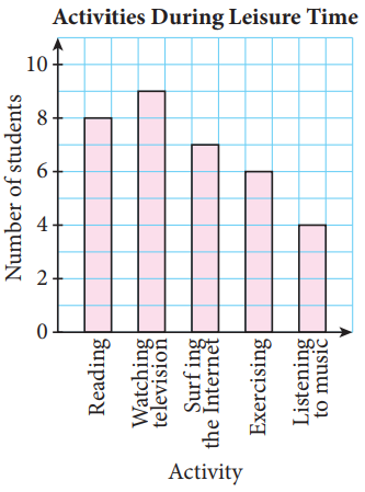
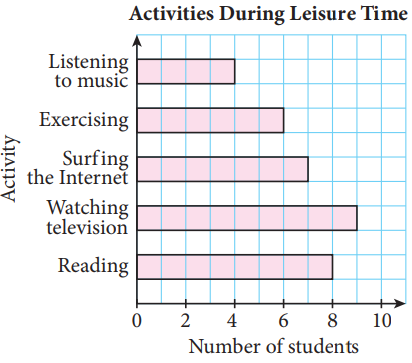
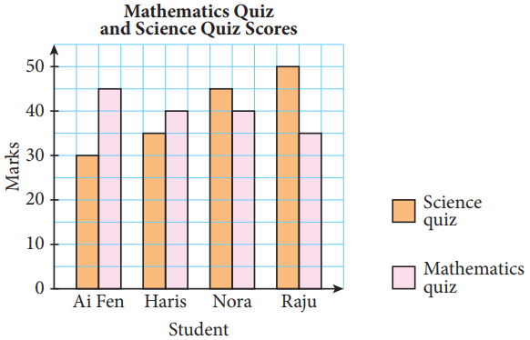
| Examples |
|
(i) Vertical bar chart
|
|
(ii) Horizontal bar chart
|
|
(iii) Dual bar chart
- A dual bar chart is suitable for comparing two sets of data.
|
|
| |
|
When representing data using a bar chart:
- the width of each bar must be uniform.
- the bars need to be evenly spaced.
|
| |
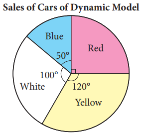
| (ii) Pie chart |
| |
- A data representation that uses sectors of a circle to show the portion of each category of the whole data.
|
| |
|
Steps to construct a pie chart.
- Find the angle of sector for each category.
- Draw a circle and divide it into different sectors based on the angles calculated.
- Label each sector.
- Write down the title of the pie chart.
|
| |
| Example |
|
|
|
| |
| (iii) Line graph |
| |
- A data representation used to display changes of data over a period of time.
- The data is represented by points which are connected in a straight line.
- The horizontal axis usually represents the time duration and the vertical axis usually represents the frequency values.
|
| |
|
Steps to construct a line graph.
- Draw the horizontal and vertical axes on a grid.
- Choose a suitable and uniform scale for both axes. The vertical axis represents data. The horizontal axis represents time.
- Plot the points and connect the points in a straight line.
- Write down the title of the line graph.
|
| |
| Example |
|
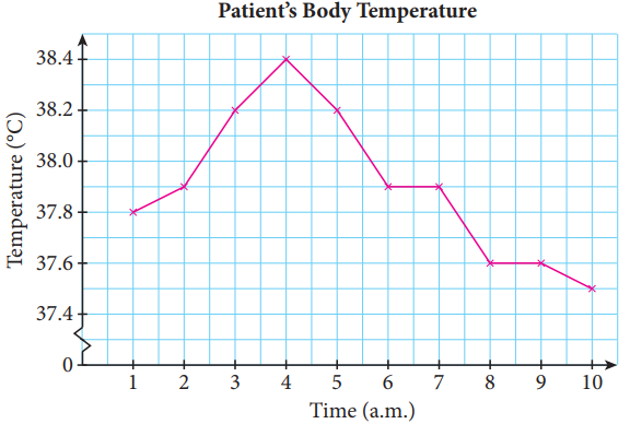
|
|
| |
| (iv) Dot plot |
| |
- Shows the distribution of data on a number line.
- The data are either clustered around certain values or spread out evenly on a number line.
- Can help us to visualise data patterns, draw inferences and make decisions.
- Can also detect unusual observations (extreme values).
|
| |
|
Steps to construct a dot plot.
- Draw a horizontal number line that covers the range of the given data.
- Plot the individual data with a dot over their values on the number line.
- Write down the title of the dot plot.
|
| |
| Example |
|
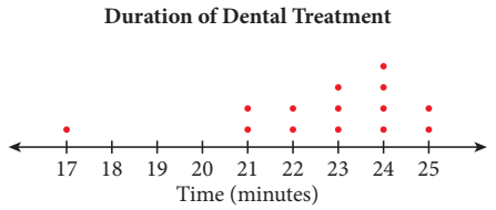
|
|
| |
| (v) Stem-and-leaf plot |
| |
- A data representation that separates the data values into stem and leaf according to their place value.
- The leaf usually is the last digit of the number.
- The stem is the remaining digit or digits on the left of the number.
|
| |
|
Steps to construct a stem-and-leaf plot.
- Write each data one by one and take the tens digit of each data value as the stem.
- The last digit of the number is written on the leaf.
- Rearrange the leaves in ascending order.
- Write a key and the title. The key indicates the unit for the stem and leaf.
|
| |
| Example |
|
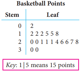
|
|
| |
| Convert a data representation to another representation: |
| |
- A data representation can be converted to other suitable representations for further analysis.
|
| |
| Interpret data representations: |
| |
- Can obtain information and hence make inferences and predictions.
|
| |
| (i) Histogram |
| |
- A data representation that displays grouped data.
- Grouped data is data that is collected in intervals.
- The width of each bar in a histogram represents a specific interval.
- The height of each bar represents the frequency in each interval.
|
| |
| Example |
|
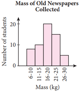
|
|
| |
- A histogram does not display the actual values of the data but displays values in a certain interval.
- A histogram can provide a display of large data sets because the data is represented in class intervals.
|
| |
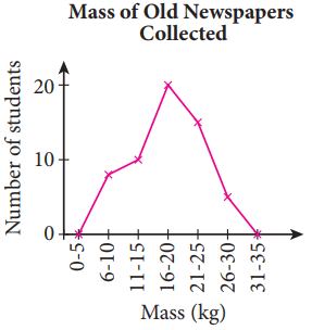
| (ii) Frequency polygon |
| |
- A graph formed by joining the midpoint of the top of each bar in a histogram with straight lines.
|
| |
| Example |
|
|
|
| |
| The importance of representing data ethically: |
| |
- Help us to analyse and interpret data much easier.
- To avoid confusion.
|
| |
|
To represent the data ethically,
- the scale used in the representation must be consistent and start at \(0\).
- the data displayed must be accurate.
|
| |